
Reinventing Videoconferencing for Polycom
Building Polycom's first UX discipline from scratch — establishing the company's first research program, designing the room system UI and hardware, and scaling a single design language across every product in the portfolio.
FIRST UX DESIGN MANAGER · DESIGN SYSTEMS · RESEARCH · HARDWARE UX · 10FT UI · US PATENT
80%
Usability improvement
7
Product lines unified
1ST
UX discipline at Polycom
1
US Patent (8,593,502 B2)
CONTEXT
Polycom was a category leader betting on design to stay ahead of a commoditizing market.
Polycom was the undisputed leader in enterprise videoconferencing. In 2008, the company made a strategic bet: that as the technology category matured and competitors closed the hardware gap, user experience would become the new differentiator. I was brought in as Polycom's first UX Design Manager to lead that effort.
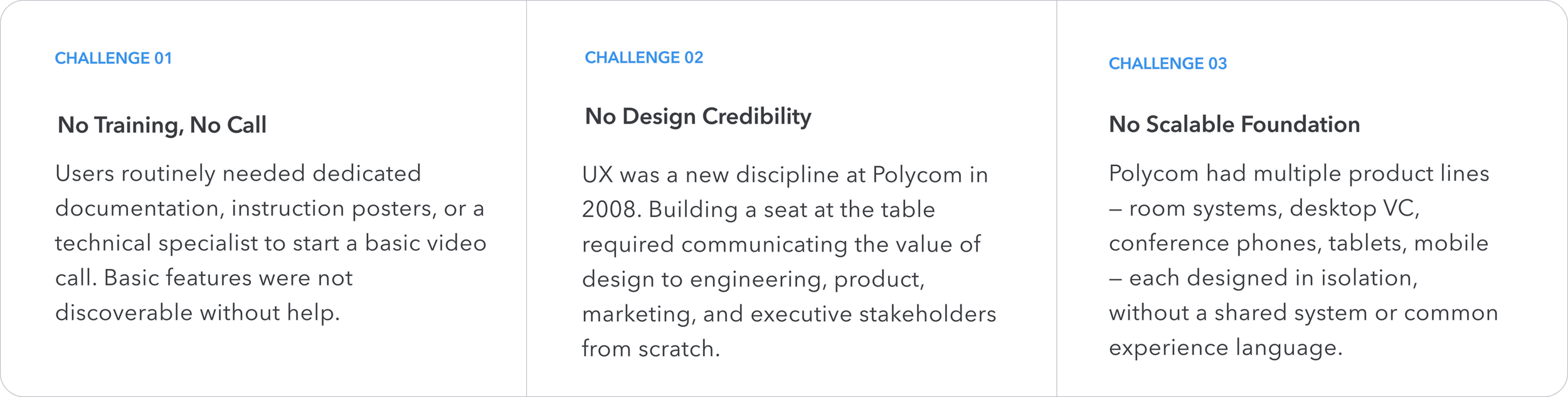
The experience problem was real and visible: conference rooms required dedicated "Getting Started" posters just to operate basic features. A dedicated technical specialist was often needed to start a call. Users found the systems intimidating and avoided them.
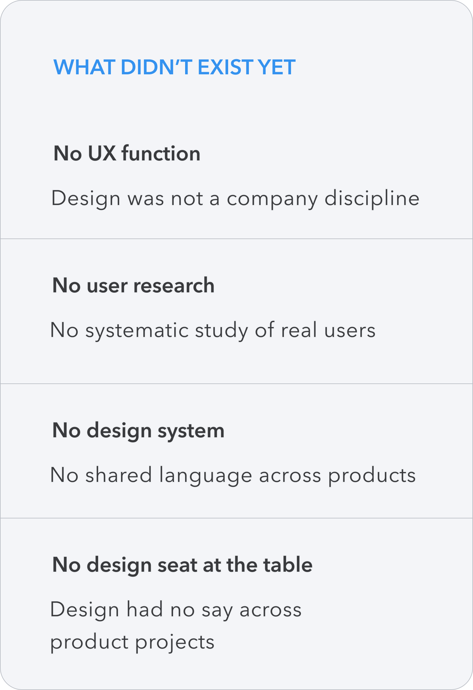
Polycom had world-class hardware engineers. What it had never had was a design discipline — no UX team, no research function, no systems thinking applied to the experience. In 2008, I joined as the company's first UX Design Manager to change that.
Complexity was a barrier to adoption, and lack of adoption was the business problem.
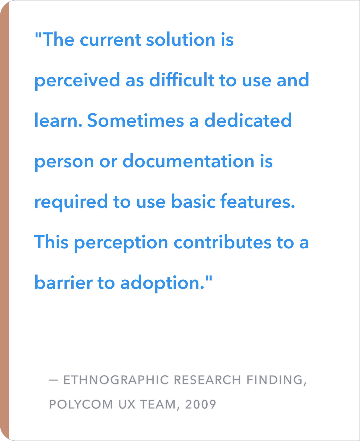
Research would later quantify what was visible in the field: the product was perceived as difficult to use and learn. But the implications went beyond usability. As video calling became table stakes, ease of use would determine who won. The complexity that had once been tolerable — a premium system implies some learning curve — was now a competitive liability.
THE PROBLEM
MY ROLE
Building the practice, the team, and the system — from zero.
I joined Polycom in 2008 as the company's first UX Design Manager. I was responsible for establishing design as a formal discipline at the company — which meant simultaneously building the team, creating the research practice, evangelizing UX to stakeholders, and leading the end-to-end redesign of Polycom's full product portfolio.
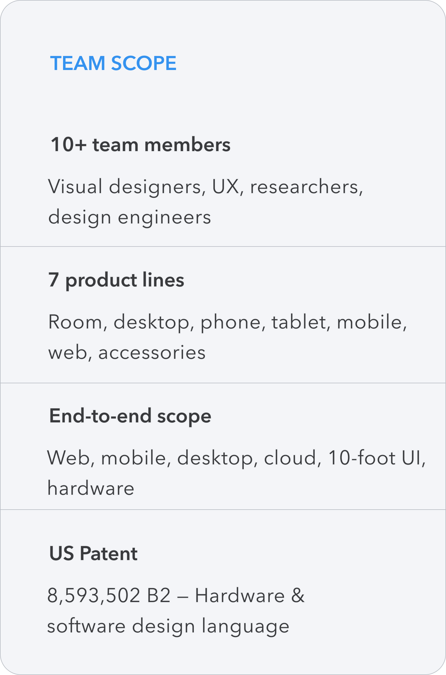
I grew the team from 2 to 10+ designers, researchers, and design engineers. I earned design a seat at every product table — across engineering, product management, marketing, and executive leadership. And I made the case that the only scalable path forward was a systems-first approach: one unified design language, scaled across every product a user might touch throughout their day.
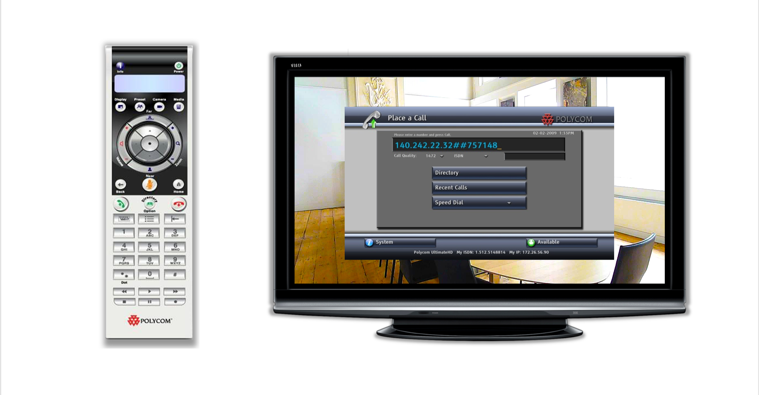
I also collaborated with industrial design and engineering to create Polycom's first hardware and software design language — connecting the physical remote to the on-screen experience, resulting in a US patent.
Field research revealed what no spec sheet could.
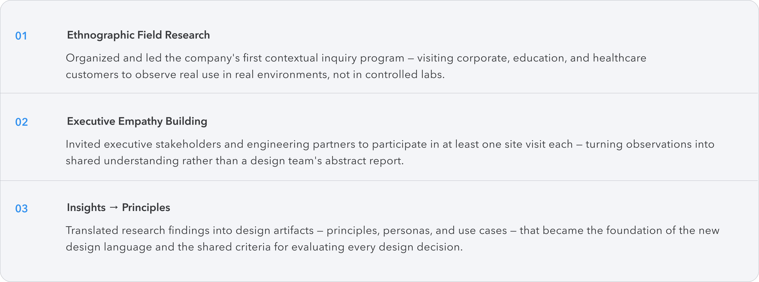
UX was a new concept at Polycom in 2008. To build credibility — and genuine empathy across the organization — I organized and led the company's first ethnographic research program: taking the team and executive stakeholders directly into customer environments to observe real use in context.
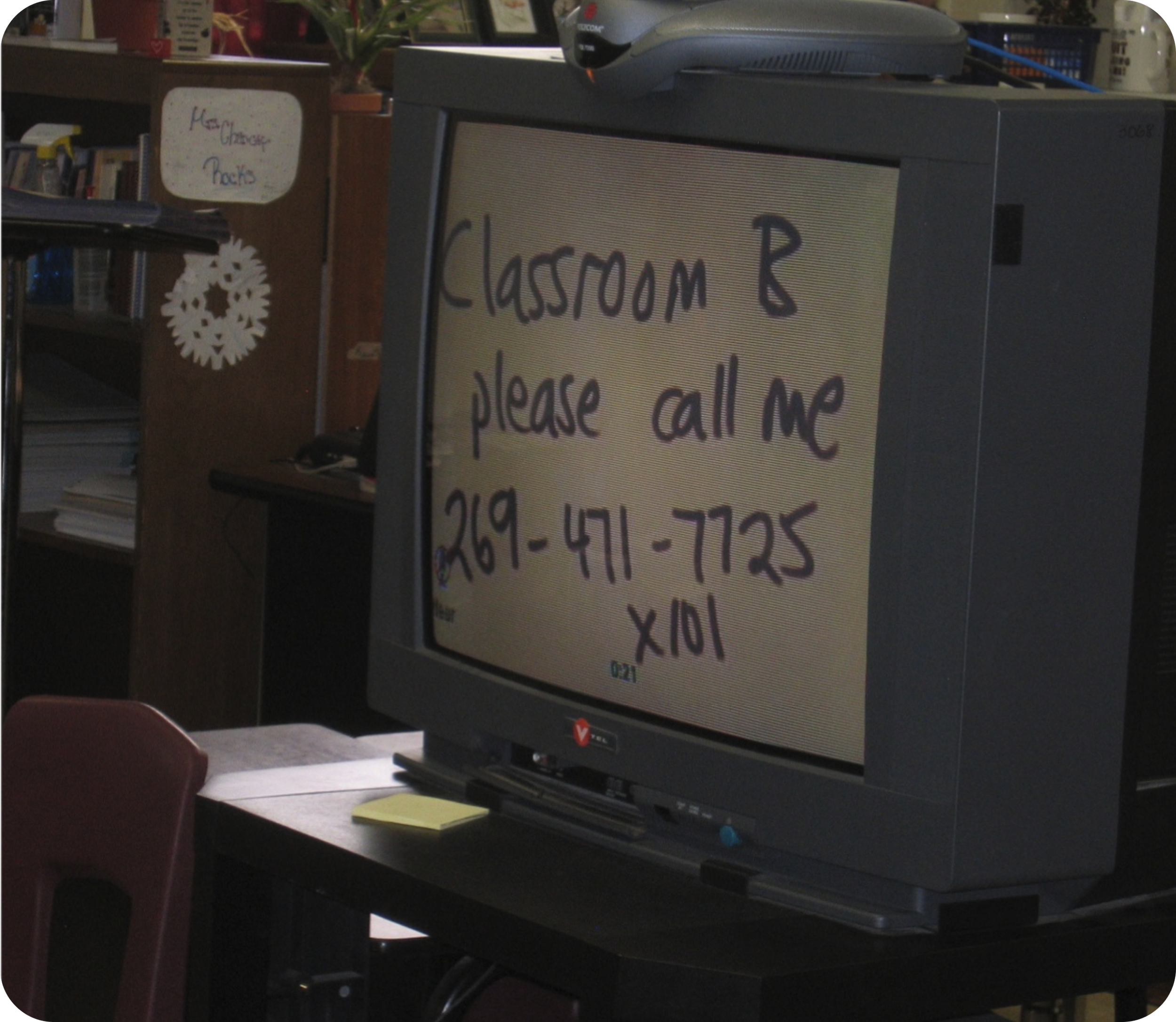
The field visits were transformative. What we found wasn't an edge case — it was the norm. Getting started posters in every conference room. Dedicated technical staff required to initiate calls. Teachers writing their phone numbers on paper and holding it up to the camera because they couldn't unmute their microphone.
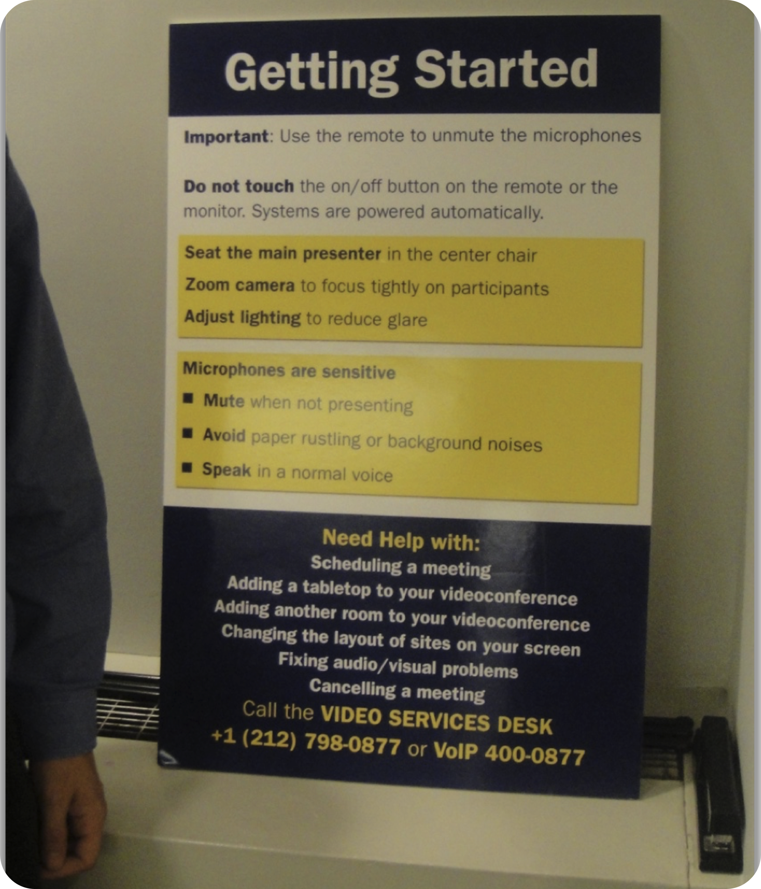
Every conference room we visited had a large laminated "Getting Started" guide. Users needed constant reminders to perform basic tasks.
A teacher forgot how to unmute her microphone, so she wrote a note and held it up to the camera to communicate with the other classroom.
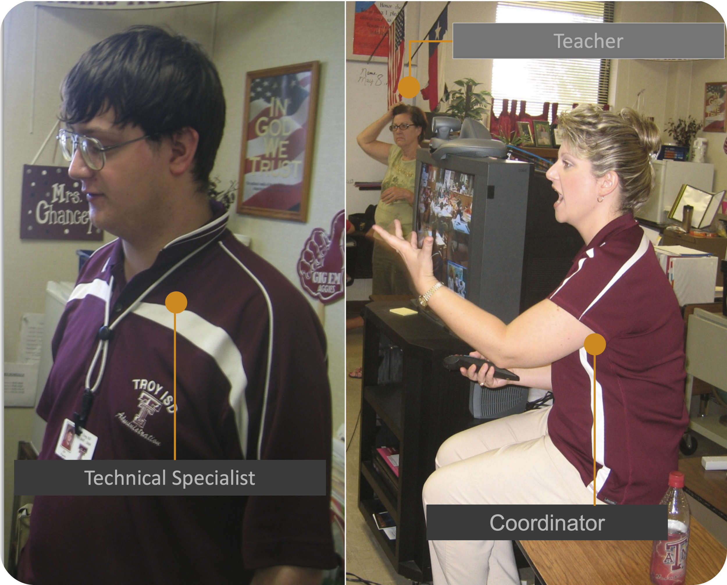
In many cases, a dedicated technical specialist was needed to initiate a basic call — a significant and measurable barrier to adoption.
DESIGN SYSTEM WORK
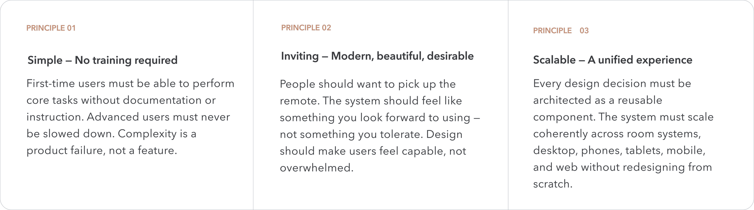
Three principles. One design system
Research findings were distilled into three foundational principles that governed every decision — from the on-screen interface to the physical remote control. These became the shared language between design, engineering, and product management across the company.
THE PROBLEM
One design language. Every Polycom product.
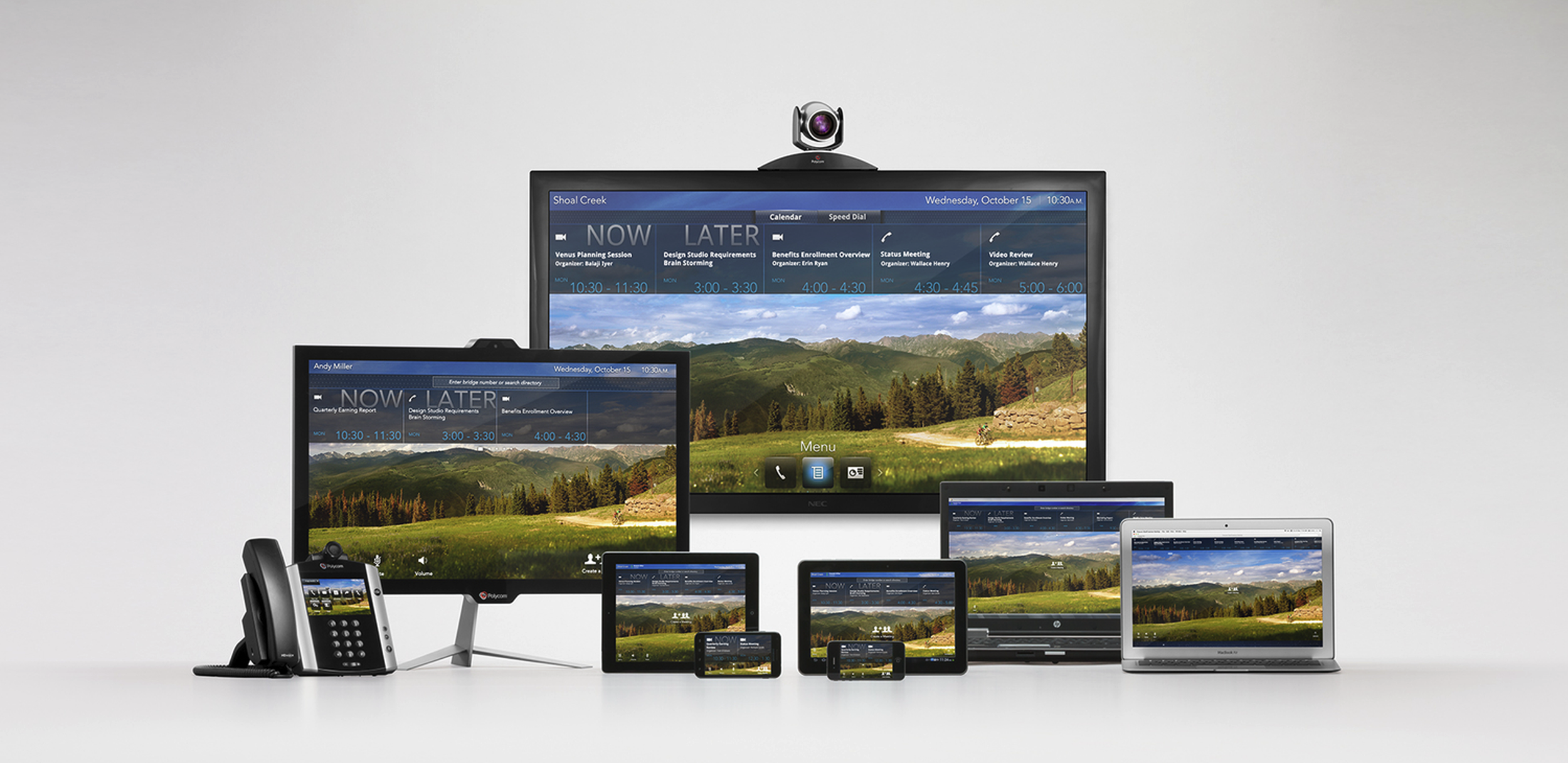
Once the room system established the design language — the visual principles, component patterns, interaction models, and hardware aesthetic — the real ambition kicked in: scaling that language across every Polycom product a user would encounter throughout their day.
Starting from one unified design language, my team scaled the experience across Polycom's entire portfolio — ensuring that moving from a conference room system to a desktop unit to a mobile app felt coherent, intentional, and familiar. Users who learned one Polycom product would feel at home on all of them.
BEFORE
AFTER
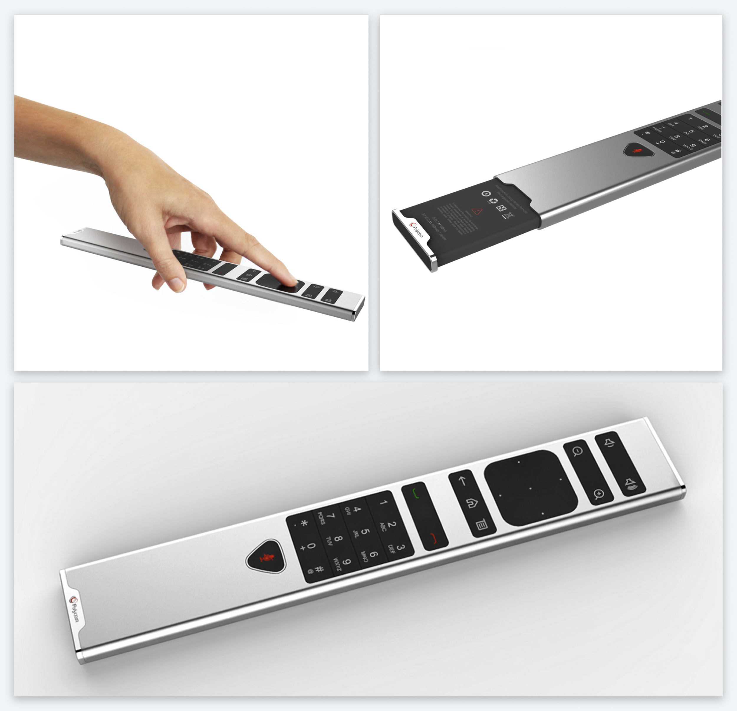
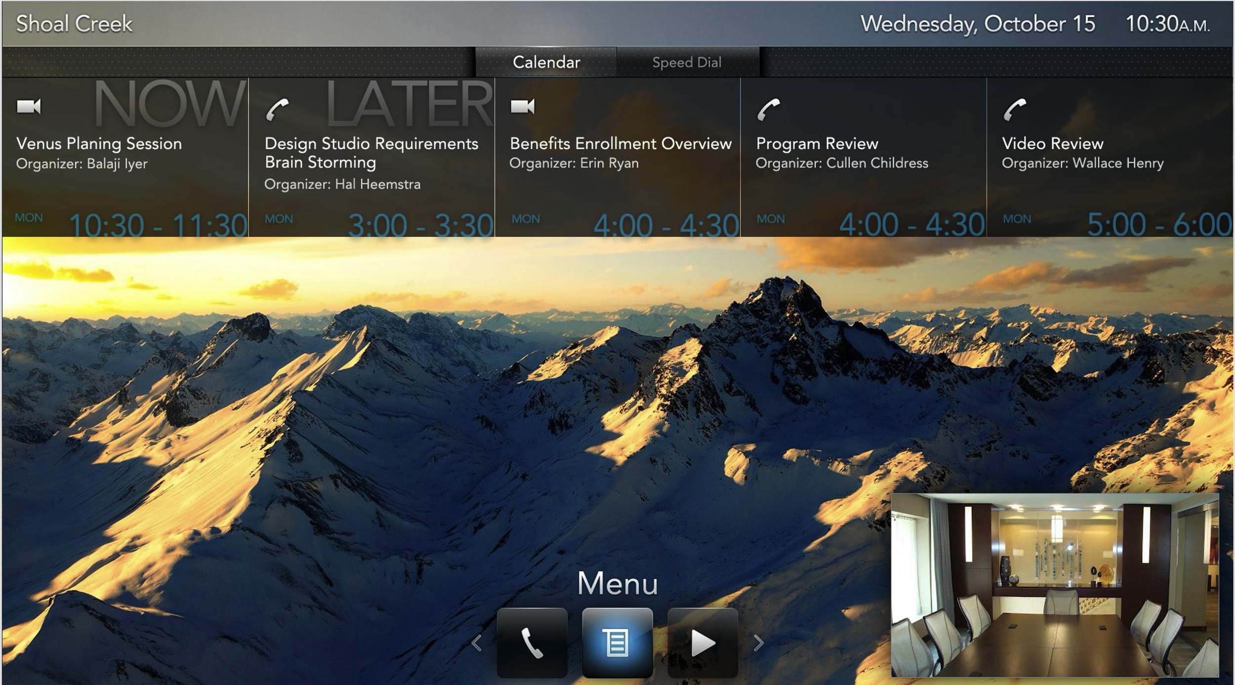
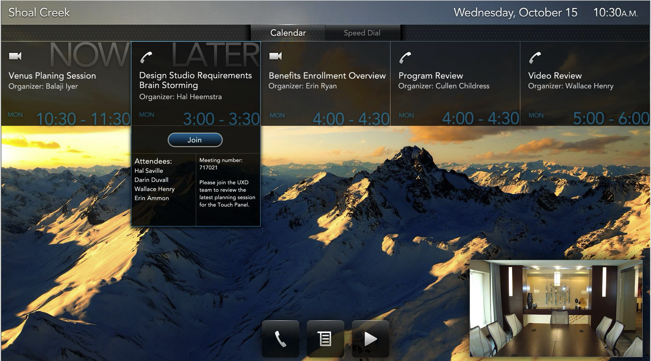
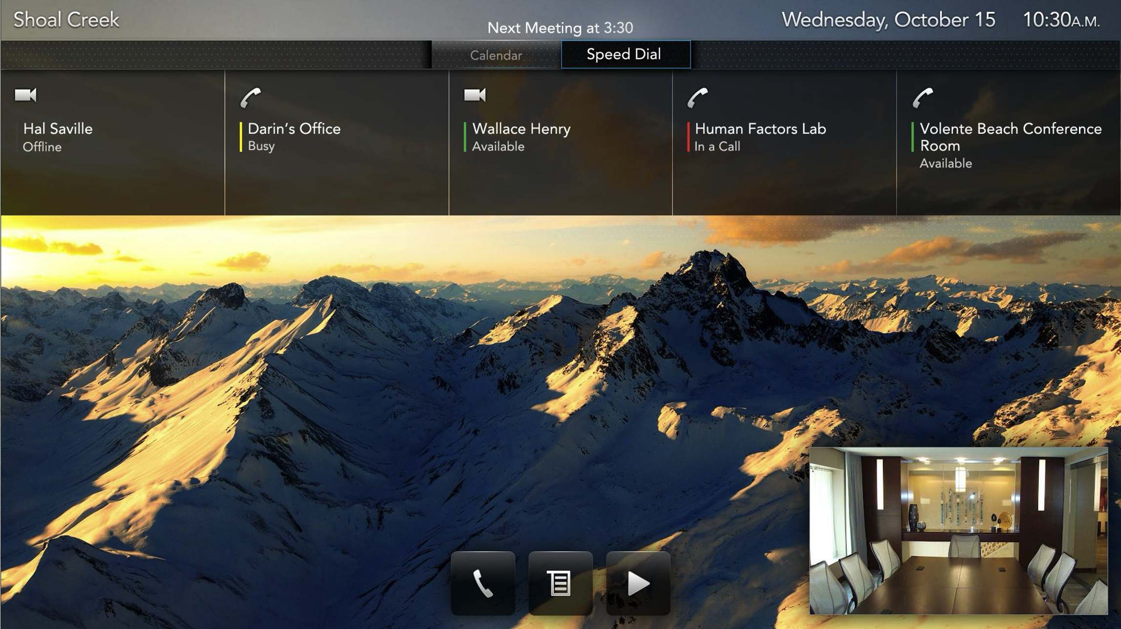
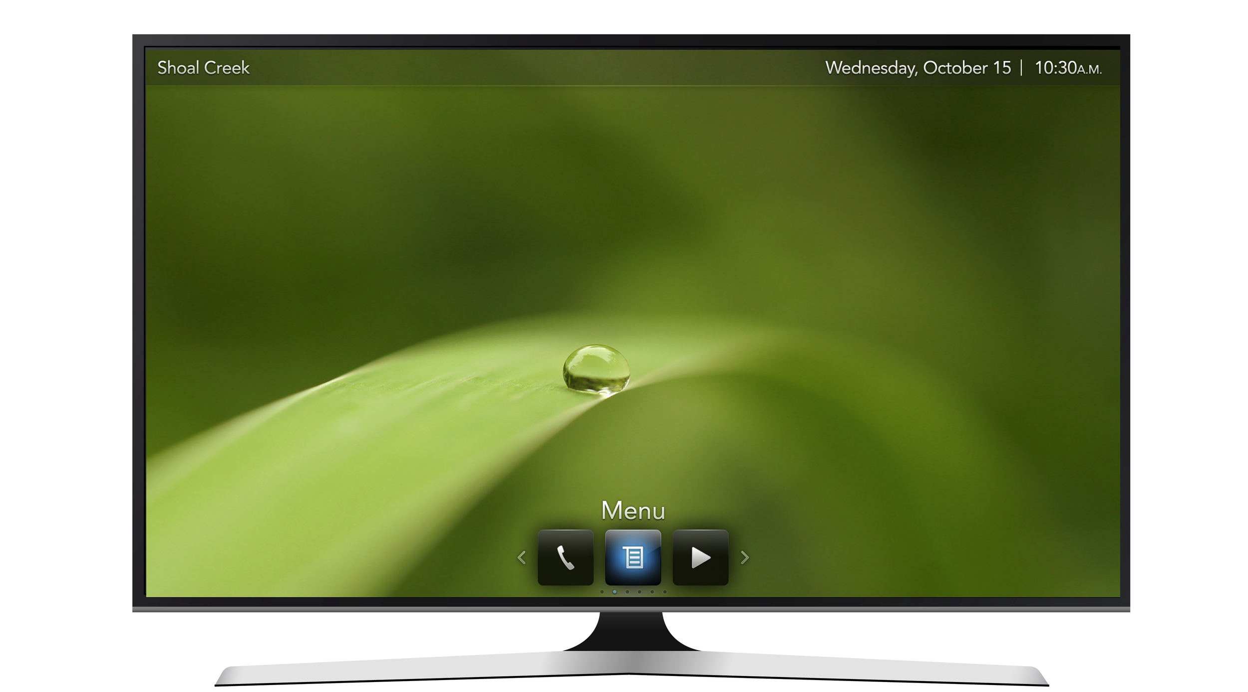
10ft UI design
The first surface to redesign was also the most constrained — an on-screen UI navigated entirely by remote from across a room. Simple, Inviting, and Scalable had to hold at 10 feet.
WHAT I LEARNED
Insights build the case for design and innovation.
Research doesn't just inform design — it builds organizational alignment. Executives who visited customers with us made faster, better decisions than those who read the findings in a deck. A design system built from user principles also scales better than one built from components; start with the why, and the what follows. Introducing design to an organization that has never valued it is ultimately a change management problem, not a design problem — credibility is earned through proof, not persuasion. Hardware and software are not separate design problems either; the physical object is part of the experience, and designing them apart produces products that feel apart. Scaling a design language across a product portfolio is a business strategy as much as a design one — it reduces cost, accelerates development, and protects brand coherence simultaneously. And a product people want to pick up is a product people actually use. Aesthetics isn't decoration. It's the first signal of usability.