
Intuit Agent Chat AI Platform
Built the web and mobile platform layer for Intuit's conversational AI — the system, patterns, and governance that let 66 mission teams ship 63 net-new agentic experiences in production. Flexibility was designed into the system, not around it: themable tokens for brand expression, dynamic rendering for controlled team-specific injection.
DESIGN SYSTEMS · GEN AI · TEAM LEADERSHIP · WEB + MOBILE
2.2M+
Component insertions in the past year
66
Mission teams voluntarily adopted
63
Net-new AI experiences in production
290%
of FY26 platform goal
PROBLEM
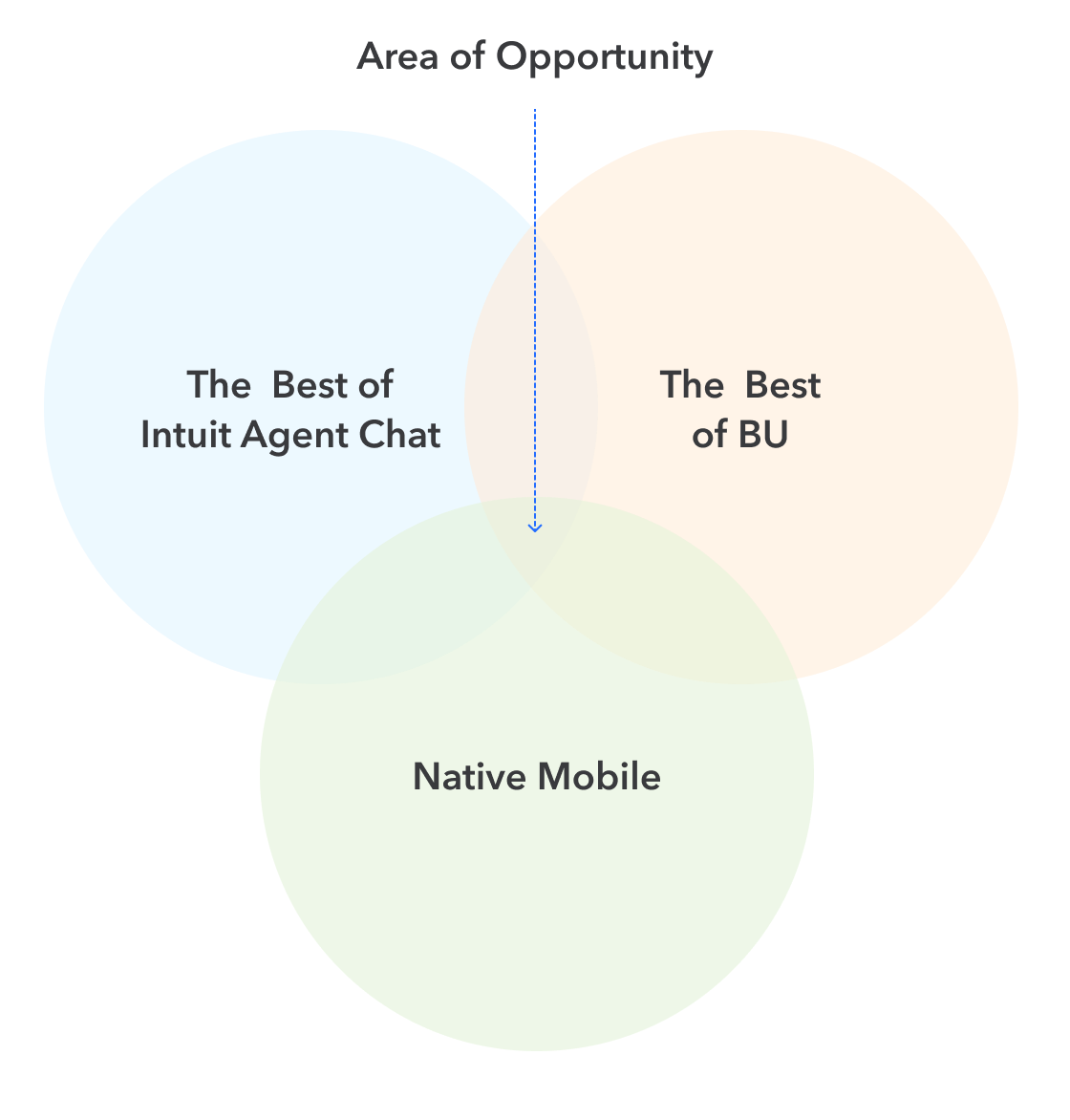
Many teams, one platform
Intuit's AI ambitions span TurboTax, QuickBooks, Credit Karma, Mailchimp, and ProConnect — dozens of product teams building AI-powered chat for customers who depend on Intuit with their financial lives. Before this platform existed, each team was solving the same hard problems independently. How should an AI agent communicate that it's thinking? What does a trustworthy response look like on mobile versus an immersive desktop? How do you surface follow-up suggestions without derailing a conversation? Every team had answers. None of them agreed.
The result was fragmented AI experiences across products customers depend on — and no shared foundation to fix it.
MY ROLE
Solving both problems simultaneously
As Group Design Manager for Intuit's Generative AI Design System, I led a team of designers responsible for solving both challenges at once — building the foundational platform that powers AI-native chat across Intuit's product portfolio, and building the trust and partnerships that made teams want to adopt it.
APPROACH
Five principles that shaped the work
Design for every team, not 1:1 use cases
01
02
Flexibility as a key tenet
03
Total support for themes
End-to-end capabilities within the PDX platform stack
04
05
Collaborate to innovate

Co-creation, not compliance
We couldn't mandate adoption. So we set one goal: build a platform so useful, so well-considered, and so much better than anything a team could build alone, that choosing not to use it would be illogical. Everything about how we work follows from that.
Synthesis Model
Co-Creation Process
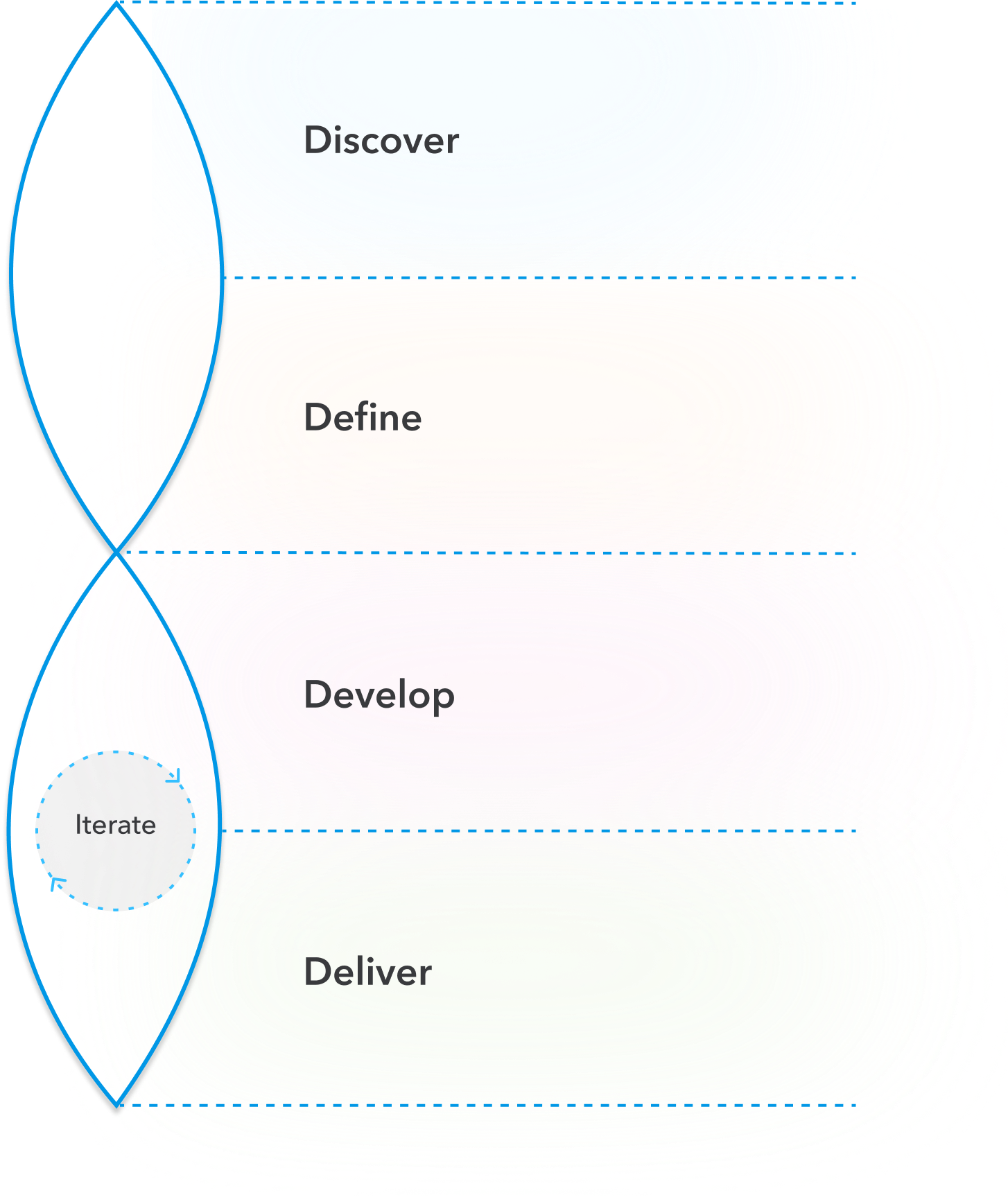
AUDIT
Catalog the BU team's existing patterns — what's working, what's not, where the gaps are
IDENTIFY VARIANCES
Their patterns vs. our foundation — find the real divergences worth solving together
WORKING SESSIONS
Workshops with the BU team — align on direction, experiment quickly, lower the cost of getting it wrong
EVOLVE TOGETHER
New patterns become durable quickly once we have evidence — both teams end up with something better

DESIGN STRATEGY
Designed to flex. Built to last
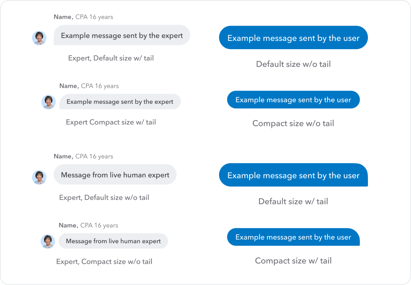
AI moves faster than any design system can keep up with by staying rigid. So we made a deliberate architectural choice: define where the system should flex and where it should hold. Components that touch brand expression were designed with built-in flexibility — lowering the cost of experimentation for any team working in new territory. Components that carry trust signals were built to last — held to a tighter standard so that when evidence confirmed a pattern worked, it became the foundation everyone builds on.
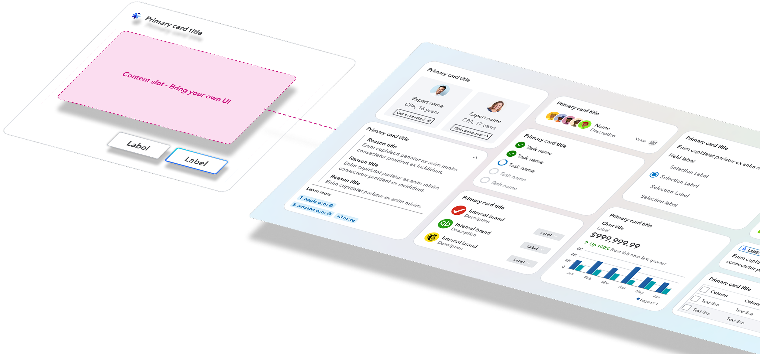
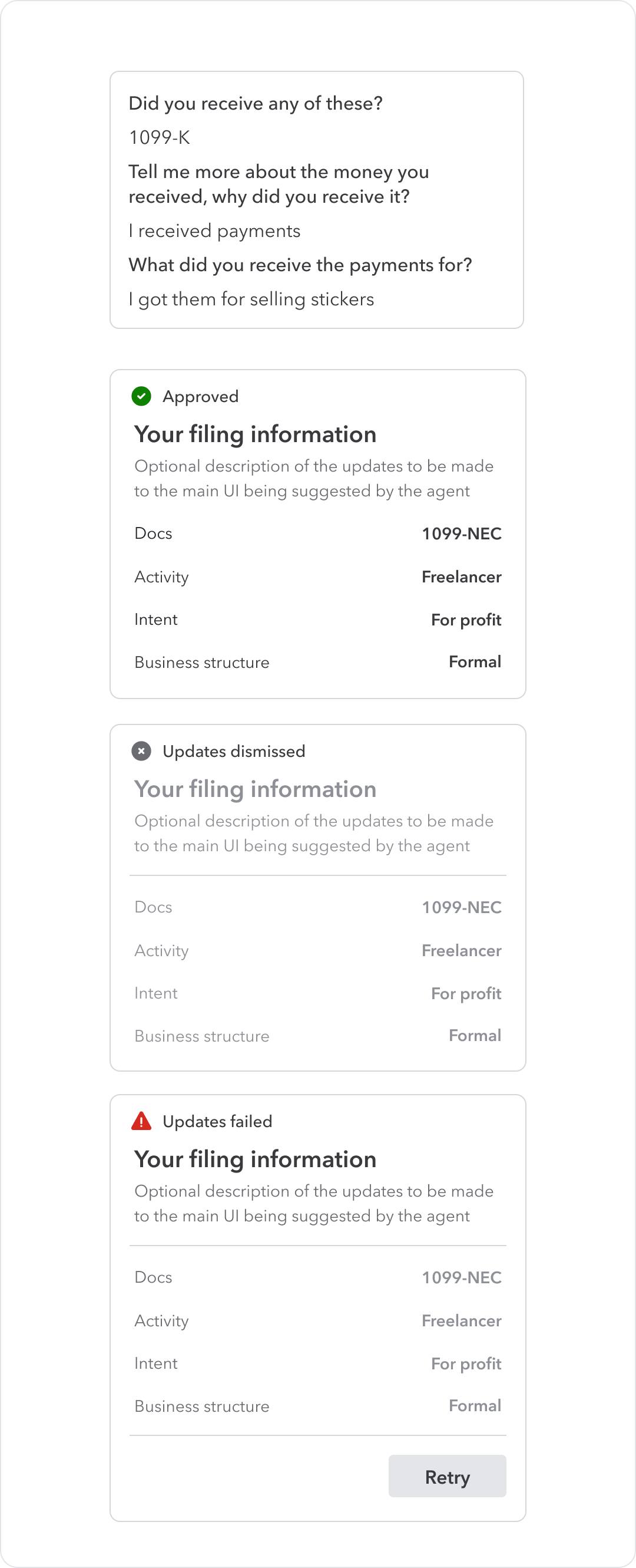
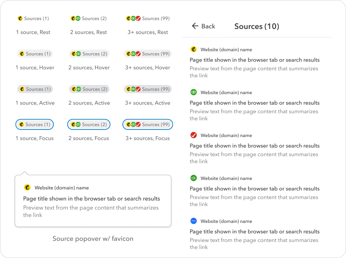
Four layers. Each independently controlled. The content block is where product teams bring their own data, brand and UI.
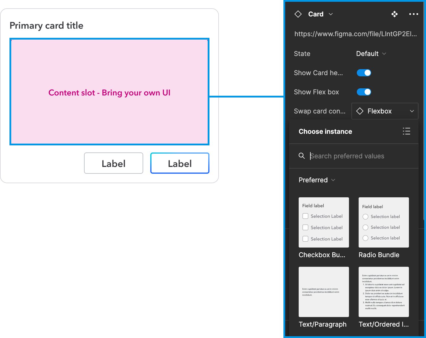
Dynamic Content Cards
01
These Cards are built on four independent layers. Each layer can be changed without touching the others — that's the source of the flexibility.
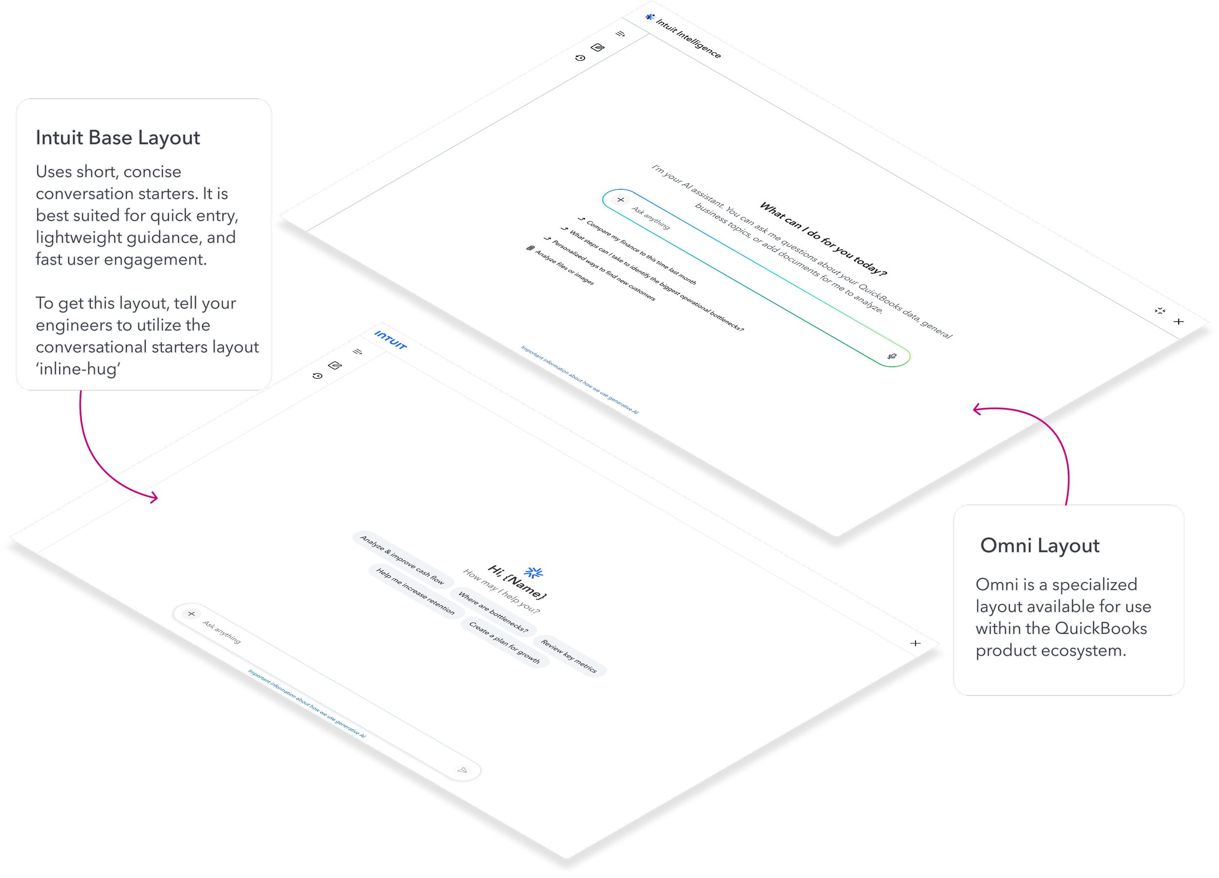
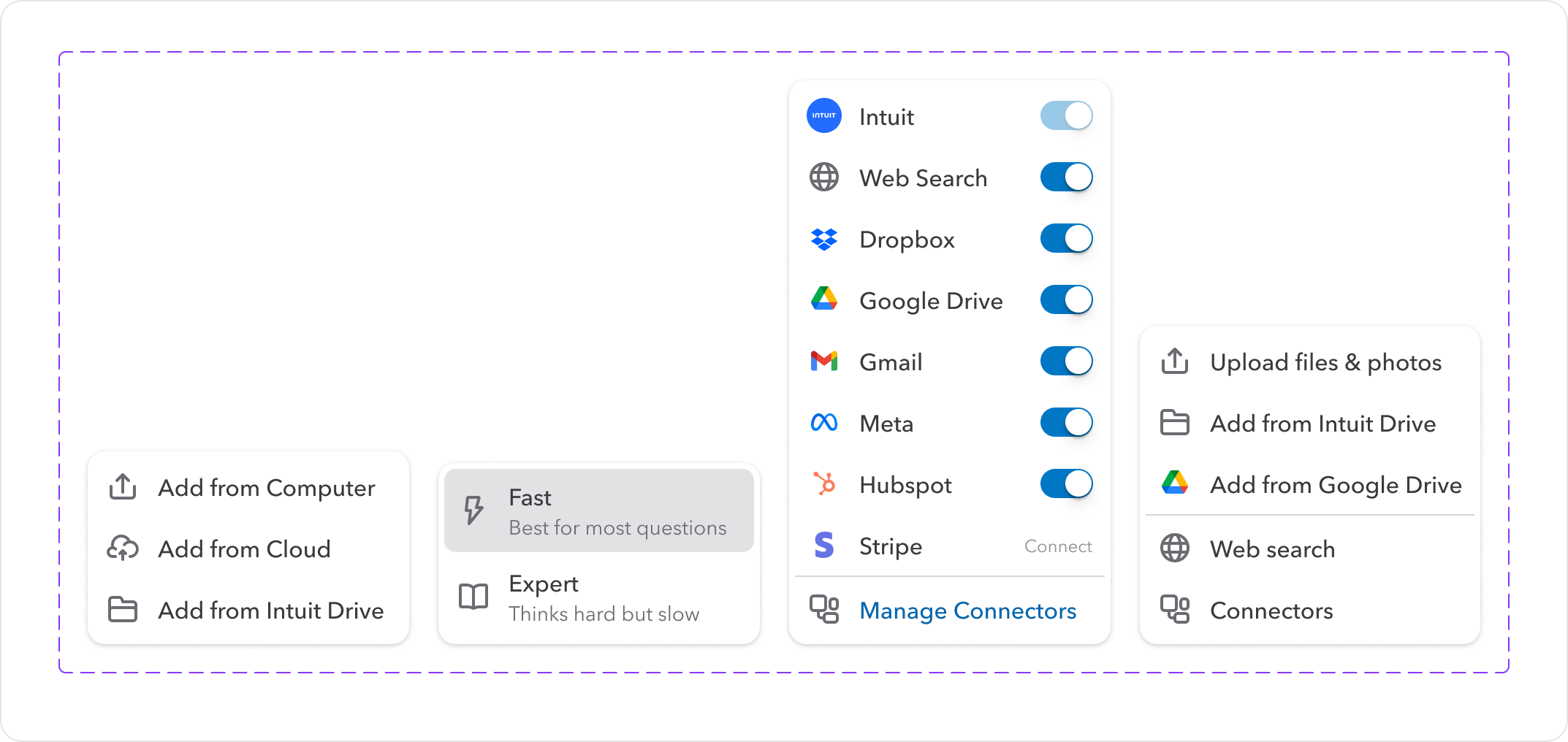
Dynamic Layout Flexibility: one platform, two brand expressions
02
QuickBooks needed their brand expression beyond Intuit baseline. Rather than forcing them off the platform or building a separate system, we evolved the architecture to support it. The same four-layer structure renders two completely different products.

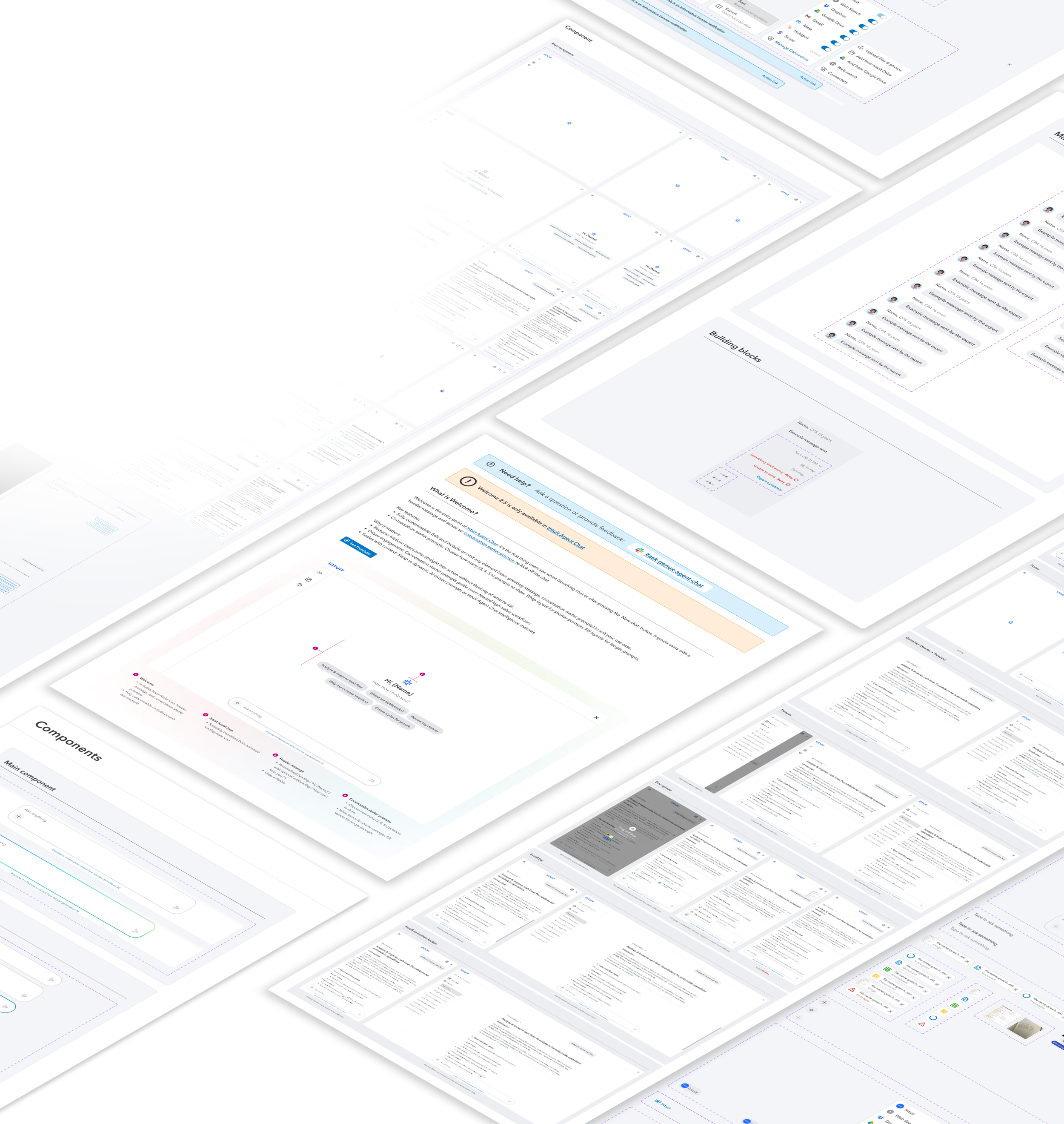
Two libraries. One System.
Web and Mobile built and maintained in parallel — not a port, not a subset. The same design decisions expressed in the right form for each platform, available in Figma and code.
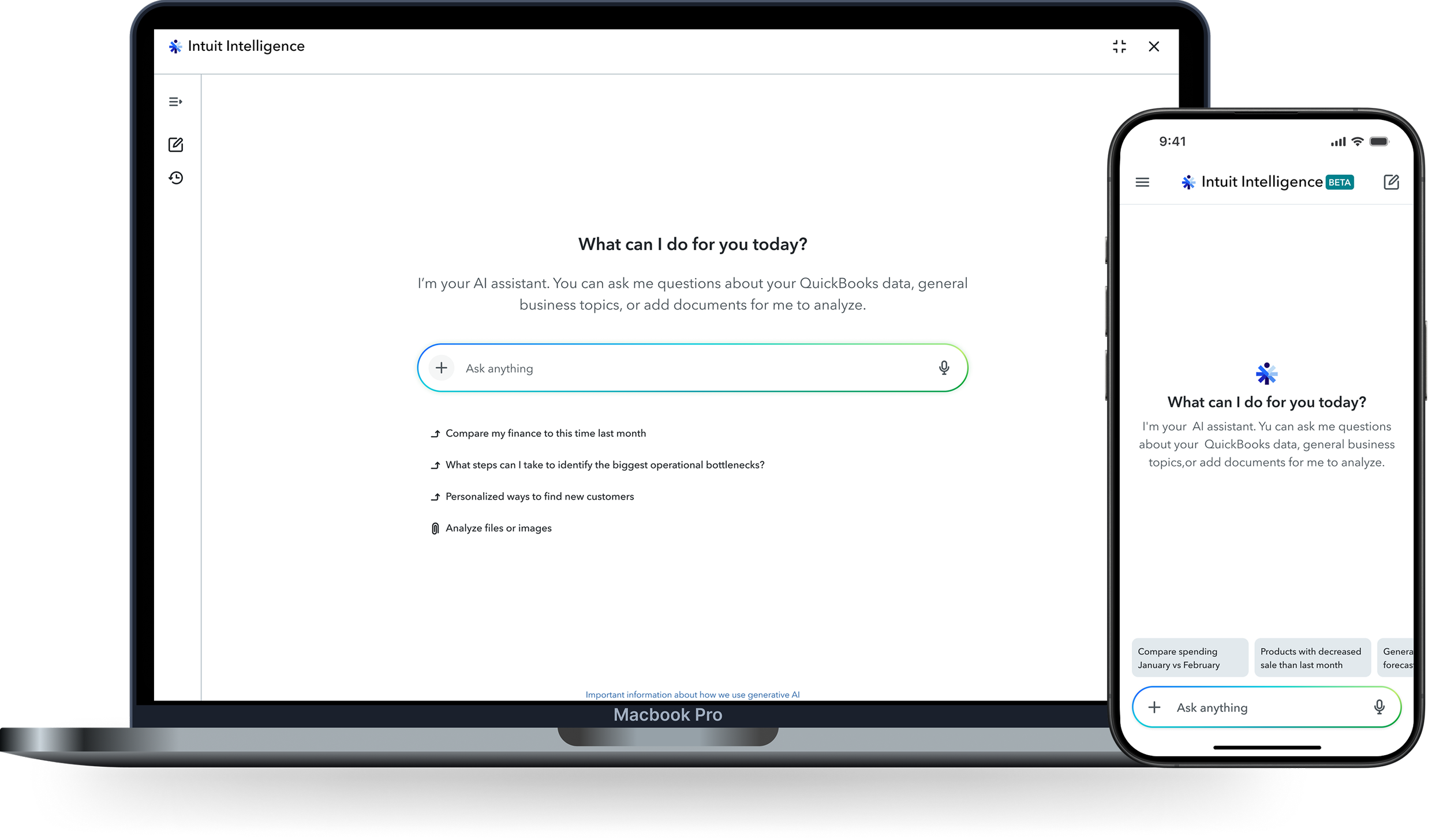
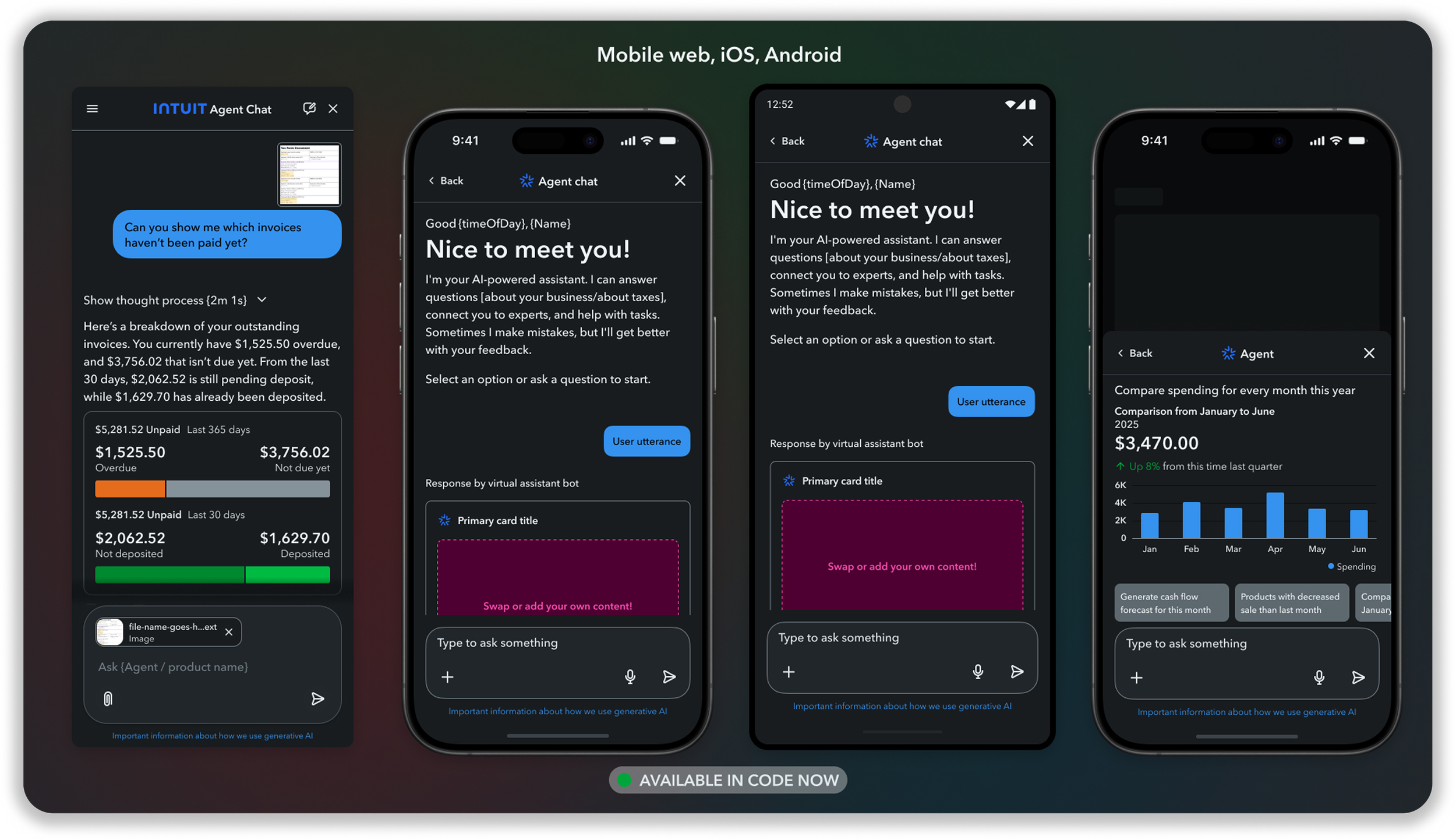
Built for every screen
Same components, 3 break points
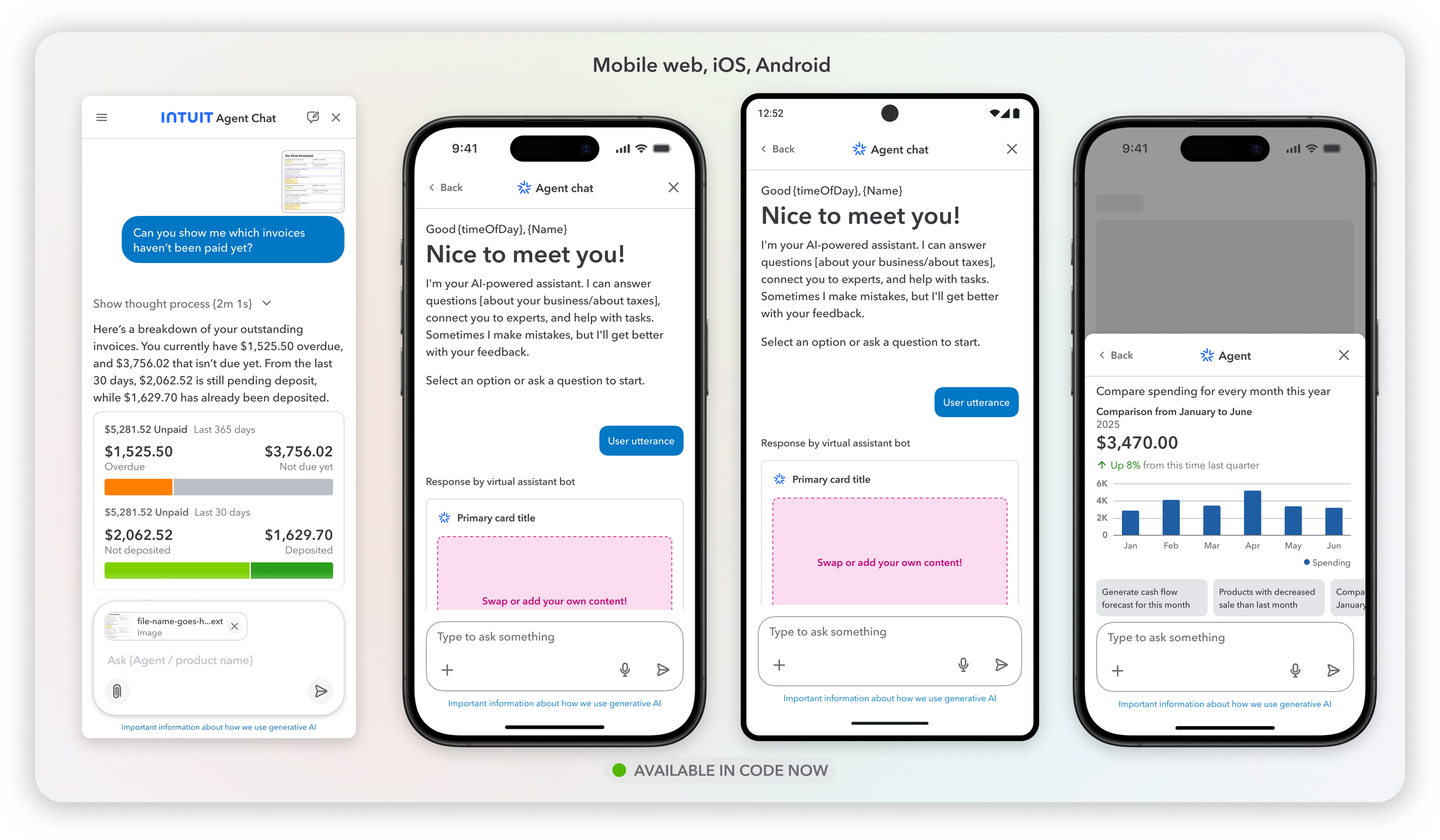
One component five brand expressions
Teams don’t just apply a color theme—they compose entirely new layout expressions from the shared component set, staying on-system while feeling native to their product
RESPNSE
TRUST & CONFORMATION
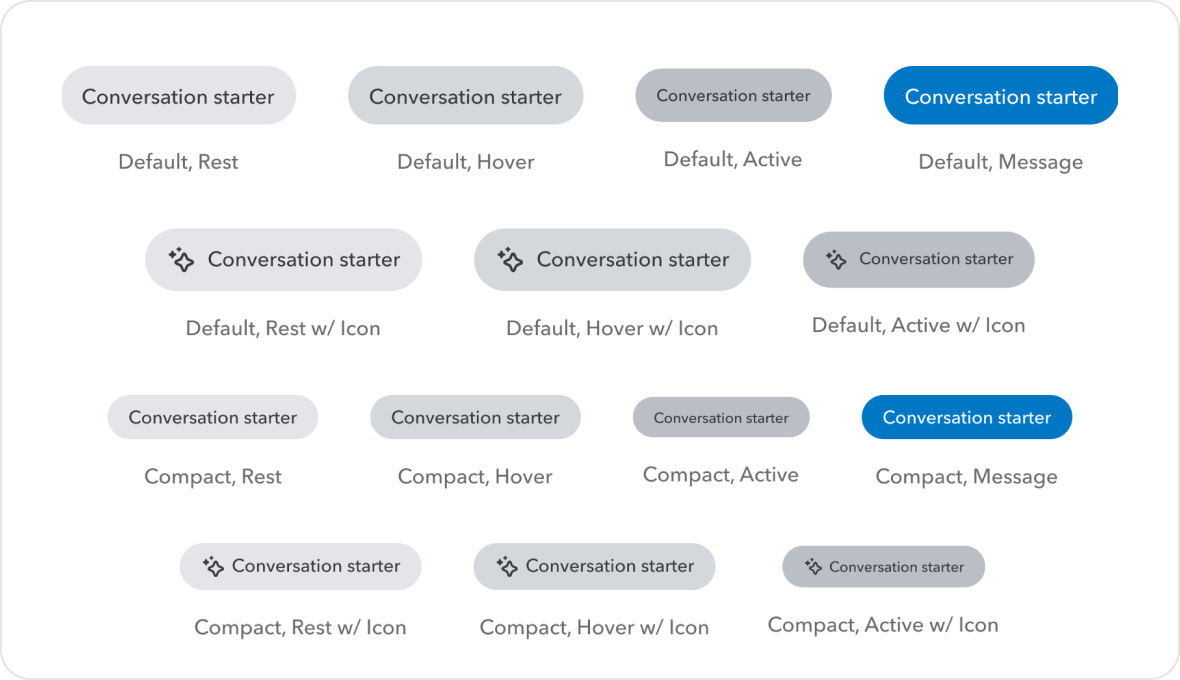
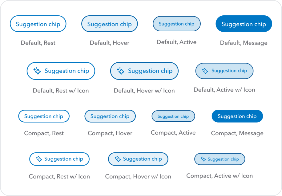
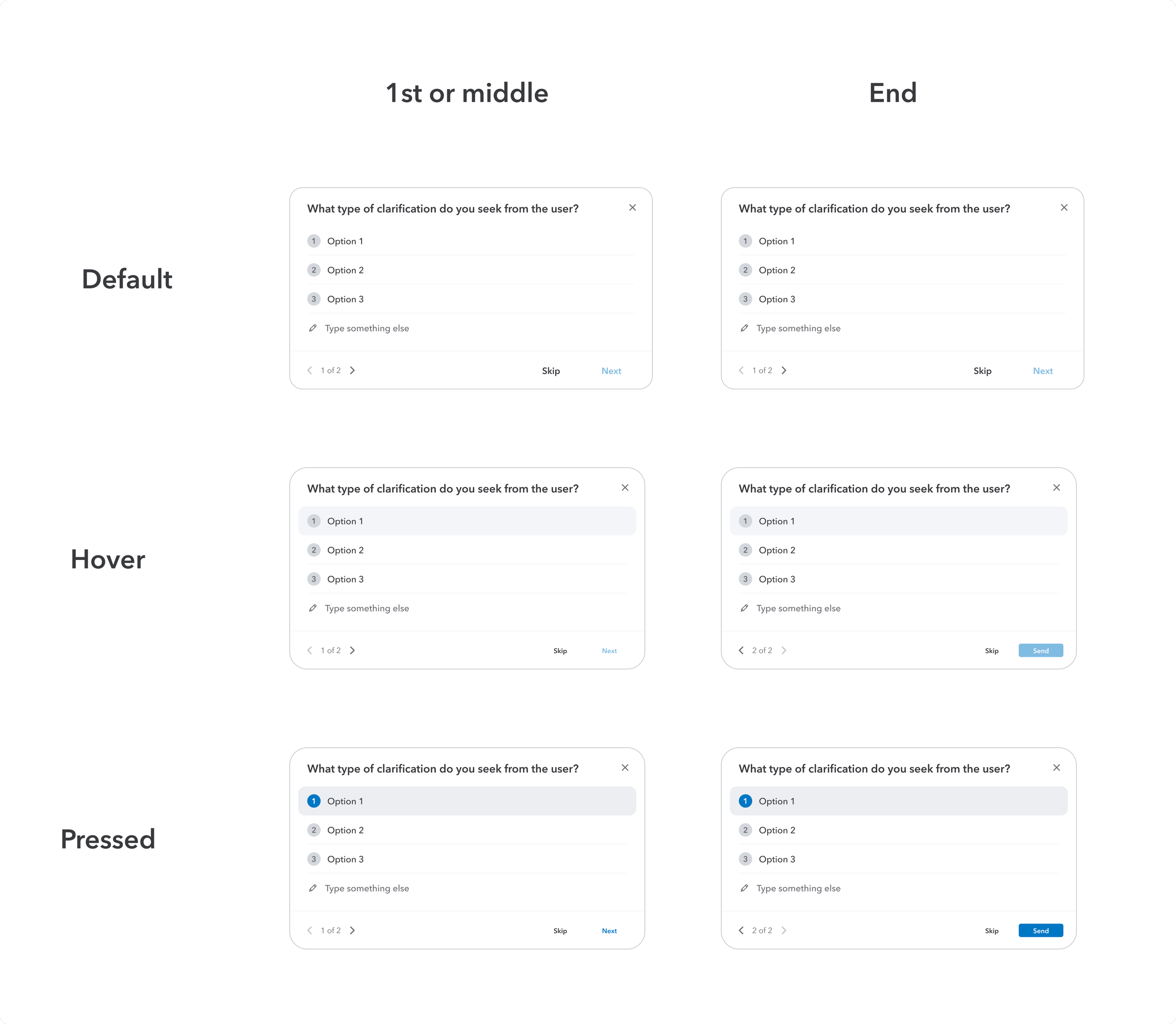
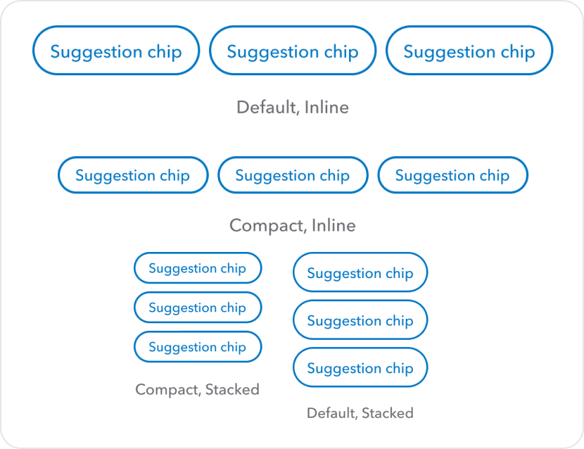
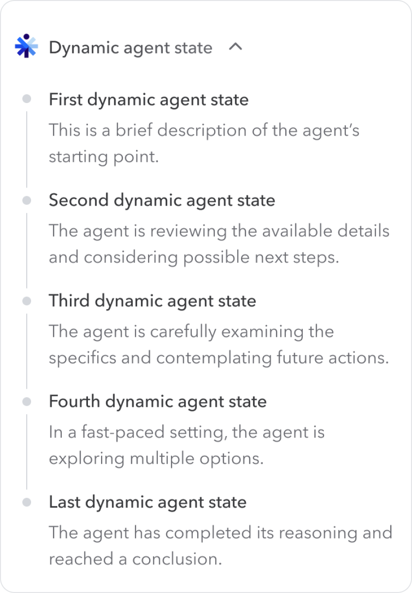
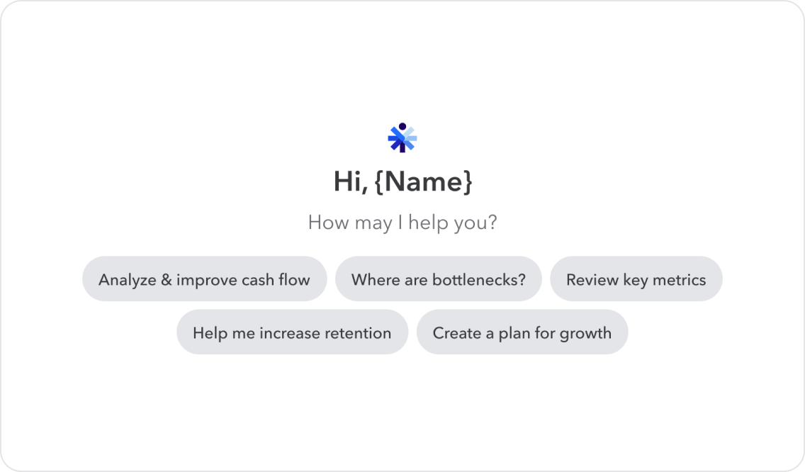
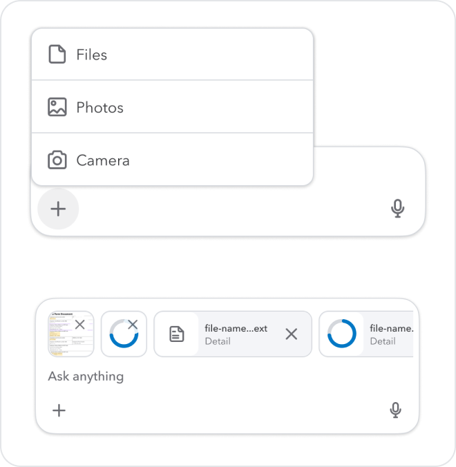
Every component has a job in the conversation.
We organized the library the same way.
INTERACTION
ENTRY
WHAT I LEARNED
Earning teams' confidence in the platform inspired us to build a better one.
Building a design system for AI experiences required inventing patterns that didn't exist anywhere. Every decision required original thinking, user research, and cross-functional alignment with engineering and product leadership. More than anything, this project reinforced that when adoption is earned rather than mandated, you are constantly making the case for quality, for consistency, for the long-term value of shared infrastructure. That tension made the work more rigorous — and the outcomes more durable.